Project overview
Crafting a Cohesive Icon Set: Design Principles for Paramount+’s 79 Icon Collection
In this project, I developed a comprehensive set of design principles for a new collection of 79 icons tailored specifically for Paramount+. The goal was to create a cohesive and consistent visual language that aligns with the brand's identity and enhances user experience across various platforms. The design process involved close collaboration with the product and UX teams to ensure the icons were not only visually appealing but also highly functional and intuitive for users.
Each icon was meticulously crafted to maintain clarity at various sizes and resolutions, while also adhering to a unified style that reflects Paramount+'s aesthetic. The final icon set was designed to be versatile, accommodating different use cases from mobile applications to web interfaces and TV screens.
This project underscores my ability to balance creativity with functionality, delivering designs that are both innovative and user-centric.
Process
Research & Discovery
The project began with an in-depth analysis of Paramount+'s existing design language, user needs, and brand identity. This stage involved studying competitor icon sets, understanding the platform’s various touchpoints, and identifying key requirements for the new icons.
Concept Development
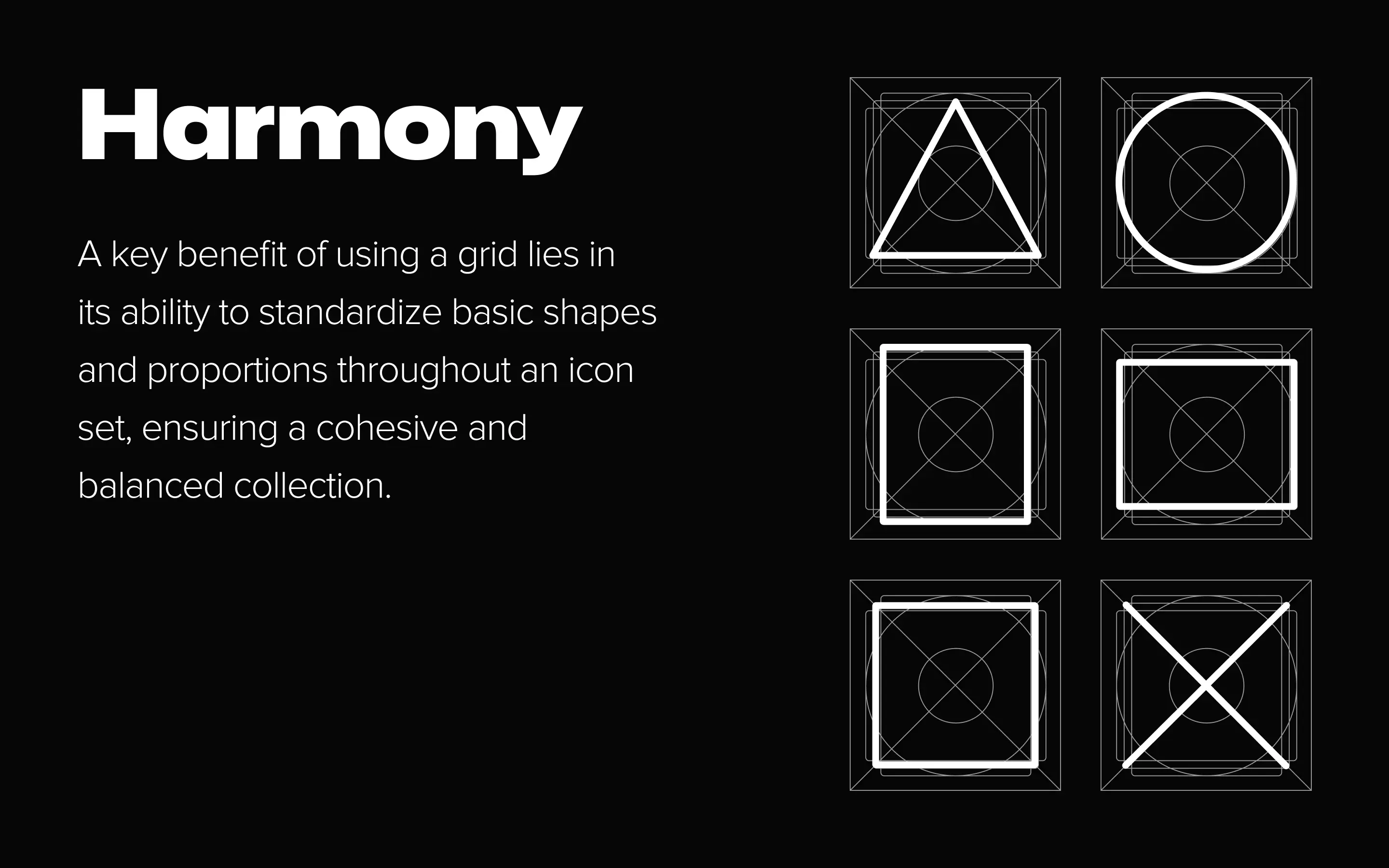
Based on the research findings, initial concepts were sketched out, exploring various styles and approaches. I focused on creating a cohesive visual system that would be flexible enough to work across different platforms, including mobile, web, and TV interfaces.
Design & Iteration
After selecting the most promising concepts, I moved on to the digital design phase, where each icon was meticulously crafted in vector format. Multiple iterations were made to refine the icons, ensuring they were not only aesthetically pleasing but also functional and clear at all sizes.


Process
Collaboration & Feedback
Throughout the design process, I worked closely with the UX and product teams to gather feedback and make necessary adjustments. Regular reviews and discussions helped align the design direction with the overall goals of Paramount+, ensuring that the icons would seamlessly integrate into the platform’s interface.
Finalization & Delivery
Once the icons were finalized, I prepared the files for various use cases and platforms, ensuring consistency and quality across all outputs. The final icon set was delivered in multiple formats, ready for implementation across Paramount+.
Testing & Implementation
The last stage involved testing the icons in real-world scenarios to ensure they performed well across different devices and screen resolutions. Any final tweaks were made based on this testing before full implementation.


Outcome
The project successfully delivered a comprehensive set of 79 custom-designed icons for Paramount+, aligning perfectly with the brand’s visual identity and enhancing user experience across multiple platforms. The new icons not only met the aesthetic standards but also improved functionality, providing clear and intuitive navigation for users. The feedback from the product and UX teams was overwhelmingly positive, noting a significant improvement in the visual coherence of the platform. The icons were seamlessly integrated across mobile, web, and TV interfaces, contributing to a more cohesive and user-friendly experience. This project stands as a testament to the successful collaboration between design, UX, and product teams, resulting in a product that truly resonates with both the brand and its users.


